Dashboards
Create a new Dashboard Dashboard A Dashboard is a configurable entity for querying one or more Data Sources and displaying the results as a table, a visualisation or some other form.Click to see more details... in the Stroom 101 folder and call it Stroom 101.
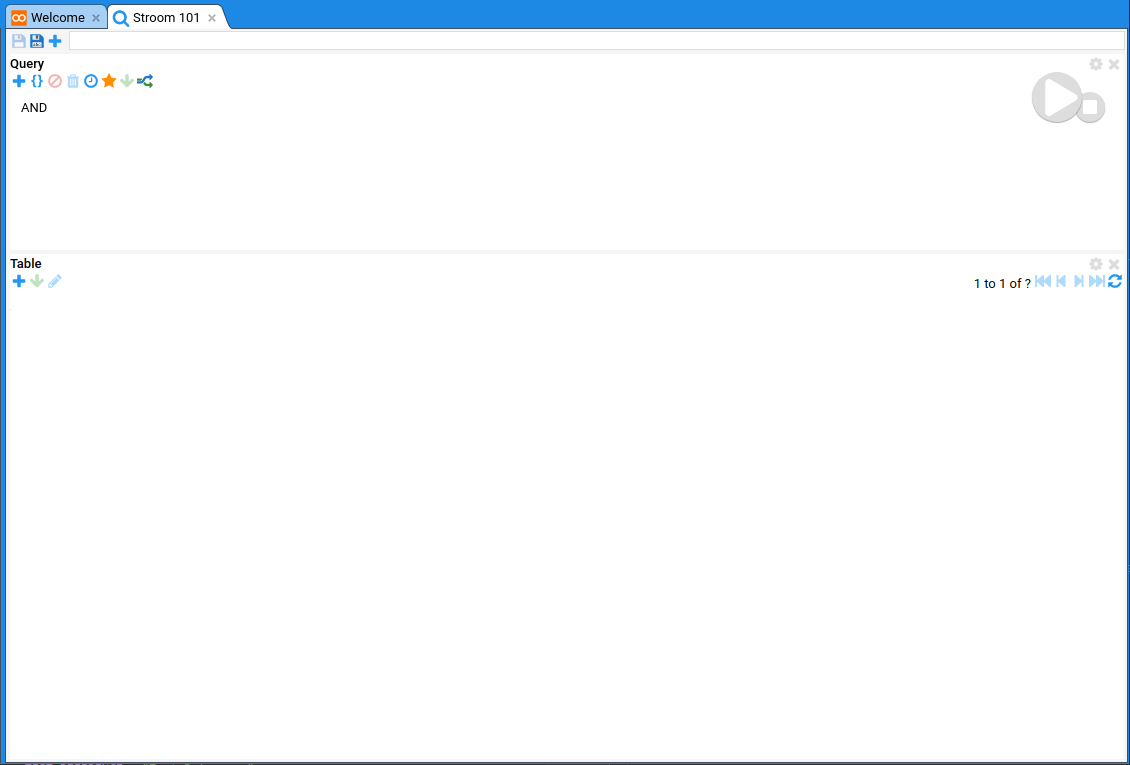
By default a new Dashboard opens with two panes; a Query Query The search Query in a Dashboard that selects the data to display. The Query is constructed using an Expression Tree of terms.Click to see more details... pane at the top to build the query; and a Table Table A Table is the tabular part of a Dashboard or Query that contains the data.Click to see more details... pane at the bottom to display the results. Dashboards are highly configurable; panes can be added and resized; they can contain multiple queries; and a query pane can provide data for multiple output panes (such as Visualisations Visualisation A document comprising some Javascript code for visualising data, e.g. pie charts, heat maps, line graphs etc. Visualisations are not baked into Stroom, they are content, so can be created/modified/shared by Stroom users.Click to see more details...).
Configuring the query data source
On the query pane click the settings button on the top right of the panel.
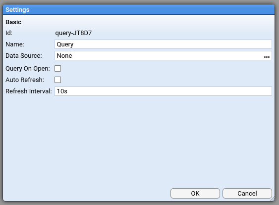
- Click on the Data Source document picker.
- Select the index you created earlier:
Stroom 101 / Stroom 101
Note
Dashboards can be made to automatically run all queries when they are opened and/or to keep refreshing the query every N seconds. This can be done in the Query settings dialog you used above.Configuring the query expression
Now add a term to the query to filter the data.
- Right click on the root AND operator and click Add Term.
A new expression is added to the tree as a child of the operator and it has three dropdowns in it (
Field
Field
A named data Field within some form of record or entity, and where each Field can have an associated value. In Stroom, Fields can be the Fields in an Index (or other queryable Data Source or the fields of Metadata associated with a Stream, e.g. Stream ID, Feed, creation time, etc.Click to see more details...,
Condition
Condition
A Condition in an query expression term, e.g.
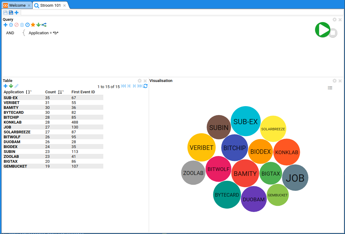
=,>,in, etc.Click to see more details... and value). - Create an expression term for the Application field:
- Field:
Application - Condition:
= - Value:
*b*
- Field:
This will find any records with b in the Application field value.
Configuring the table
All fields are stored in our index so we do not need to worry about configuring Search extraction Search extraction The process of extracting un-indexed Field values from the source Event to be used in search results.Click to see more details....
We first need to add some columns to our table. Using the button on the Table pane, add the following columns to the table. We want a count of records grouped by Application.
- Application
- Count
Note
Count is a special column (not in the index) that applies the aggregate function count().
All columns are actually just an expression which may be a simple field like ${Application} or a function.
Stroom has a rich library of functions for aggregating and mutating query results.
See Expressions.
To group our data by Application we need to apply a group level to the Application column.
- Click on the Application column
- Click
Group => Level 1
Now we can reverse sort the data in the table by the count.
- Click on the Count column.
- Click
Sort => Sort Z to A
Now click the large green and white play button to run the query. You should see 15 Applications and their counts returned in the table.
Now we are going to add a custom column to show the lowest EventId for each Application group.
- Click on the button on the Table pane.
- Select Custom (at the bottom of the list).
- Click on the new Custom column.
- Click
Expression - In the Set Expression For ‘Custom’ dialog enter the following:
first(${EventId}) - Click OK.
Instead of typing out the expression you can use the and buttons to pick from a list to add expressions and fields respectively. You can also use Ctrl ^ + Space ␣ to auto-complete your expressions.
To rename the Custom column:
- Click on the Custom column.
- Click
Rename - Enter the text
First Event ID. - Click OK.
Now run the query again to see the results with the added column.
Add a visualisation
We will add a new pane to the dashboard to display a Visualisation Visualisation A document comprising some Javascript code for visualising data, e.g. pie charts, heat maps, line graphs etc. Visualisations are not baked into Stroom, they are content, so can be created/modified/shared by Stroom users.Click to see more details....
- Click on the button at the top left of the Dashboard.
- Select Visualisation.
A new empty Visualisation pane will be added at the bottom of the Dashboard.
To configure the visualisation:
- Click on the button at the top right of the Visualisation pane.
- In the Visualisation document picker select
Visualisations / Version3 / Bubble - Click OK.
- On the Data tab that has now appeared in the dialog, assign the following table fields to the visualisation:
- Name:
Application - Value:
Count - Series:
Application
- Name:
- On the Bubble tab on the dialog, set the following:
- Show Labels:
True
- Show Labels:
- Click OK.
To change the look of your Dashboard you can drag the different panes around into different positions.
- Click and hold on the
Visualisationtext in the top left of the Visualisation pane. - Drag the cursor to the right hand side of the Table pane. You will see a purple rectangle showing where the pane will be moved to.
- Once you are happy with the position release the mouse button.
- Click and hold the mouse button on the borders between the panes to resize the panes to suit.
- Click to save the Dashboard.
You should now see something like this: