This section covers the development and maintenance of this documentation site. The documentation for Stroom is a community effort with contributions from developers and users.
Docker or Docker Desktop is required as all the build steps are performed in docker containers to ensure a consistent and known build environment.
It also ensures that the local build environment matches that used in GitHub actions.
docker-buildx is a plugin for docker that allows caching of the docker images to speed up the build process.
This may be installed by your package manager when you install docker or Docker Desktop, or you may need to install it separately.
You can confirm you have buildx by executing the following command which should give you output similar to this:
docker buildx version
(out)github.com/docker/buildx 0.9.1 ed00243a0ce2a0aee75311b06e32d33b44729689
It is possible to build the docs without docker but you would need to install all the other dependencies that are provided in the docker images, e.g. java, plantuml, puppeteer, hugo, npm, html2canvas, jspdf, graphviz etc.
It is assumed that you have a reasonable understanding of how to use Git and Github, specifically:
Github
Forks
Pull requests
Git
Branching
Pulling from upstream remotes
Cloning the stroom-docs git repository
The git repository for this site is stroom-docs (external link).
stroom-docs uses the Docsy theme (themes/docsy/) via a Go module so the theme will be pulled in when Hugo is first run.
Unless you are a committer on the gchq/stroom-docs repository, you will need to fork this repository into your own Github account.
You can then clone your fork of the repository like so (in this example it is assumed your Github username is jbloggs):
There is a version of the documentation for each minor Stroom version (see Stroom Versions.
Before you start editing/viewing the documentation you need to be working from the correct branch of the Git repository.
If for example you are adding some content that is applicable to Stroom v7.0 then you need to checkout branch 7.0.
git checkout 7.0
Creating a feature branch
If you are making changes to the documentation then the recommended working practice is to always make changes on a feature branch.
A feature branch would typically contain all commits/changes relating to a single feature, e.g. the addition of a new section, or updating the documentation for a specific change in Stroom.
Having only these changes on a branch makes it easy to merge them into the release branch (e.g. 7.0) or to just delete the branch if they are no longer needed.
A feature branch would typically be merged into the appropriate release branch by creating a pull request in GitHub.
Assuming you have checked out the desired release branch that you would like your changes to ultimately be merged into, do something like the following to create a feature branch (where add-properties-section is the name of your branch):
git checkout -b add-properties-section
This will create the named branch and check it out in one step.
Serving the site on a local server
To view the stroom-docs site in a browser you simply need to run:
If you cannot or do not want to install docker and buildx on your local machine but need to work on the documentation then you can do it from within GitHub Codespaces
.
Note
Codespaces is a paid feature on GitHub, however it comes with 60hrs of free use per month so if you are only using it for stroom-docs development this should be ample.
To develop Stroom-Docs with Codespaces do the following:
If you are developing on a fork then replace gchq in the URL with your github username.
Click on the green Code drop-down button.
On the Codespaces tab click on Create Codespace on
On first use of the Codespace it will take some time to do the initial setup of the development container.
Subsequent uses of the Codespace will load more quickly.
It will open Visual Studio Code in the browser with a terminal pane at the bottom.
In the terminal pane enter:
./serve_site.sh
This will run the Hugo development server and Codespaces should detect the open port.
You should see something like:
Click Open in Browser and it will open a URL unique to your Codespace in the browser displaying the stroom-docs site.
If this doesn’t appear then open the PORTS tab in VSCode and click the Open in Browser icon in the Forwarded Addresses column to open the served site in the browser.
Within the Codespace you can use all the git commands to pull/push/commit changes.
To stop the code space hit ctrl+shift+p, enter stop and then select Codespaces: Stop current Codespace.
Warning
When editing the documentation using Codespaces you need to manually refresh the browser tab with the served site.
It does not auto-refresh like it does when running ./serve-site.sh on your local machine.
Additional commands
Converting the PlantUML files to SVG
stroom-docs makes use of PlantUML
for a lot of its diagrams.
These are stored in the repository as .puml text files.
In order that they can be rendered in the site they need to be converted into SVGs first.
Note
Docsy has the capability to render PlantUML content in fenced code blocks on the fly.
This capability makes use of internet based servers to do the conversion therefore it is not suitable for this site as this site needs to available for deployment in environments with no internet access.
All PlantUML content should be authored in .puml files and converted at build time.
To convert all .puml files into sibling .puml.svg files, run this from the repository root:
./container_build/runInPumlDocker.sh SVG
This command will find all .puml files (in content/ and assets/) and convert each one to SVG.
It only needs to be run on first clone of the repo or when .puml files are added/changed.
The generated .puml.svg files are ignored by git.
This command will be run as part of the GitHub Actions automated build.
Warning
If runInPumlDocker.sh SVG is not run having added links to PlantUML images in the documentation, then when you build or serve the site you will see errors like this:
Error: Error building site: "/builder/shared/content/en/docs/user-guide/concepts/streams.md:57:1":
failed to render shortcode "image":
failed to process shortcode: "/builder/shared/layouts/shortcodes/image.html:54:21":
execute of template failed: template: shortcodes/image.html:54:21:
executing "shortcodes/image.html" at <$image.Name>: nil pointer evaluating resource.Resource.Name
Note
In the build docker containers your local stroom-docs repository is mounted into the container as /builder/shared/, so if you see this path mentioned in the logs this is referring to your local repository.
Running a local Hugo server
The documentation can be built and served locally while developing it.
To build and serve the site, run this from the repository root.
./container_build/runInHugoDocker.sh server
This uses Hugo to build the site in memory and then serve it from a local web server.
When any source files are changed or added Hugo will detect this and rebuild the site as required, including automatically refreshing the browser page to update the rendered view.
Once the server is running the site is available at localhost:1313.
Warning
Sometimes changes made to the site source will not be re-loaded correctly so it may be necessary to stop and re-start the server.
Building the site locally
To perform a full build of the static site, run this from the repository root:
./container_build/runInHugoDocker.sh build
This will generate all the static content and place it in public/.
Generating the PDF
Every page has a Print entire section link that will display a printable view of that section and its children.
In addition to this, the GitHub Actions build generates a PDF of the docs section and all its children, i.e. all of the documentation (but not News/Releases or Community) in one PDF.
This makes the documentation available for offline use.
To test the PDF generation, run this from the repository root:
./container_build/runInPupeteerDocker.sh PDF
Updating the Docsy theme
The Docsy theme is a dependency of this Hugo site. See Update the Hugo Docsy Module
for details on how to update the version of the Docsy theme.
In those instructions when it says to run a hugo command you need to do it from within the hugo docker container.
./container_build/runInHugoDocker.sh bash
This will give you a bash prompt inside the container that has the hugo binary available.
The container has access to your local stroom-docs repository (from where you ran runInHugoDocker.sh) and the initial directory is the root of the repository.
Inside the container the root of the repository is mounted as /builder/shared.
To leave the container’s shell type exit.
Alternatively you can run a single command directly, e.g. to update Docsy to 0.6.0 do:
./container_build/runInHugoDocker.sh 'hugo mod get -u github.com/google/docsy@v0.6.0'
2 - Managing Stroom Versions
How to manage documentation for different versions of Stroom.
The Docsy theme supports site versioning so that multiple versions of the site/documentation can exist and link between each other.
For this documentation site, each version of the site is tied to a minor release of Stroom, e.g. 7.0, 7.1, 7.2, 8.0 etc.
Each Stroom version is represented by a git branch with the same name.
There is an additional git branch legacy that is for all Stroom versions prior to 7.0 and will be removed once the versions prior to 7.0 are no longer supported.
Documentation changes for an as yet unreleased Stroom version would be performed on the master branch which does not get published.
When it is ready for publishing then create a version branch from master.
When the combined site is built, each version will exist within a directory as siblings of each other, i.e.
/         # Latest version content lives here (i.e. copy of v8.0)
/7.0/
/7.1/
/7.2/
/8.0/     # Latest version is also published here but only used by CI build.
/legacy/
The master branch is NOT published to GitHub Pages or included in the release artefacts.
If a change needs to be applied to all branches then it is best to make it in the oldest branch for which the documentation is published, and then merge the changes the changes up the chain, e.g. legacy => 7.0 => 7.1 => 7.2 => 8.0 => master.
If a change needs to be made to a feature that was introduced in v7.6 say, then the change should be made on the 7.6 branch and merged up.
Versioned Site Configuration
The configuration file config.toml in each branch defines such things as what version the branch is and what constitutes the latest version of the documentation.
Note
This section is for reference only.
The build script ci_build.sh will amend the various version property values prior to building the site.
Therefore when creating a new version branch you do not need to edit the config.toml file.
This example is from the 7.1 branch and is based on there being versions legacy, 7.0 and 7.1, with 7.1 being the latest.
7.0
[params]
  # Menu title if your navbar has a versions selector
  # to access old versions of your site.
  version_menu = "Stroom Version (7.0)"

  # If true, displays a banner on each page warning that
  # it is an old version. Set this to true on each git branch
  # of stroom-docs that is not the latest release branch
  archived_version = true

  # Used in the banner on each archived page.
  # Must match the value in brackets in "version_menu" above
  version = "7.0"

  # A link to latest version of the docs. Used in the
  # "version-banner" partial to point people to the main
  # doc site. Ignored for the latest version
  # Should be the same on all version branches.
  url_latest_version = "/../"

  # The version number of the latest version. Used in the
  # "version-banner" partial to tell people what the latest
  # version is. Ignored for the latest version
  latest_version = "7.1"

  # The name of the github branch that this version of the
  # documentation lives on. Used for the github links in the
  # top of the right hand sidebar. Should match the last part
  # of url_latest_version.
  github_branch = "7.0"

  # A set of all the versions that are available.
  [[params.versions]]
    version = "7.1 (Latest)"
    url = "/"
  [[params.versions]]
    version = "7.0"
    url = "/../7.0"
  [[params.versions]]
    version = "Legacy"
    url = "/../legacy"
7.1
[params]
  # Menu title if your navbar has a versions selector
  # to access old versions of your site.
  version_menu = "Stroom Version (7.1)"

  # If true, displays a banner on each page warning that
  # it is an old version. Set this to true on each git branch
  # of stroom-docs that is not the latest release branch
  archived_version = false

  # Used in the banner on each archived page.
  # Must match the value in brackets in "version_menu" above
  version = "7.1"

  # A link to latest version of the docs. Used in the
  # "version-banner" partial to point people to the main
  # doc site. Ignored for the latest version
  url_latest_version = "/../"

  # The version number of the latest version. Used in the
  # "version-banner" partial to tell people what the latest
  # version is. Ignored for the latest version
  latest_version = "7.1"

  # The name of the github branch that this version of the
  # documentation lives on. Used for the github links in the
  # top of the right hand sidebar. Should match the last part
  # of url_latest_version.
  github_branch = "7.1"

  # A set of all the versions that are available.
  [[params.versions]]
    version = "7.1 (Latest)"
    url = "/"
  [[params.versions]]
    version = "7.0"
    url = "/../7.0"
  [[params.versions]]
    version = "Legacy"
    url = "/../legacy"
params.versions
Setting the params.versions values is somewhat confusing.
The url property will result in a relative href in the built site that is relative to the site root for that version.
The following is the built HTML for v7.1 which is the latest.
<a class="dropdown-item" href="./">7.1 (Latest)</a> <!-- 7.1 is located at the site root -->
<a class="dropdown-item" href="./7.0">7.0</a> <!-- 7.0 is located in the 7.0 sub-directory of the site root -->
<a class="dropdown-item" href="./legacy">Legacy</a>
The following shows how params.versions are set in each version branch, assuming that 7.1 is the latest version.
legacy
# Versioned root is /legacy
# Latest is parent
# Other versions are siblings

[[params.versions]]
  version = "7.1 (Latest)"
  url = "/../"
[[params.versions]]
  version = "7.0"
  url = "/../7.0"
[[params.versions]]
  version = "Legacy"
  url = "/"
7.0
# Versioned root is /7.0
# Latest is parent
# Other versions are siblings

[[params.versions]]
  version = "7.1 (Latest)"
  url = "/../"
[[params.versions]]
  version = "7.0"
  url = "/"
[[params.versions]]
  version = "Legacy"
  url = "/../legacy"
7.1
# Versioned root is /
# Latest is site root
# Other versions are children

[[params.versions]]
  version = "7.1 (Latest)"
  url = "/"
[[params.versions]]
  version = "7.0"
  url = "/7.0"
[[params.versions]]
  version = "Legacy"
  url = "/legacy"
Automated build process
On every commit Github Actions will build the version of the site that the commit is on to ensure that Hugo can convert the content into a static site.
It will also build all the other versioned branches to check that they work.
On a nightly basis, Github Actions will also run a scheduled build on the HEAD commit of the master branch.
In addition to building each version branch of the site, it will establish if the combined site needs to be published.
It will determine this by comparing the commit hashes of each version branch with the contents of a commit.sha1 file that is published in each of the version directories on https://gchq.github.io/stroom-docs.
If any one of the hashes is different then the combined site will be assembled and published.
This automated build will look for any branches matching the pattern (legacy|[0-9]+\.[0-9]+) and for each one will do the following:
Checkout that branch
Modify config.toml to set the various version properties.
Build the site for that version using Hugo
Add the site files to a combined site
Generate the documentation PDF
Build the site with no other versions configured
Create a zip of the single version site
Once each site has been processed it will:
Copy the latest version of the site to the root of the combined site
Create a single zip file containing the combined site
Although the build is run on the master branch it will use the HEAD commit of each of the release branches to build the site(s).
The build and release can be forced by adding the text [publish] to the commit message on master.
This is useful in testing, or if updated documentation is needed for any reason.
For example you can run this on the master branch to force:
git commit --allow-empty -m "Empty commit to force [publish]" && git push
Merging changes
When you make changes to one of the version branches (7.0, 7.1, etc.), either directly or with a pull request from a feature branch, you will need to merge the changes up through each of the versions until they reach master.
Merging up through multiple branches is tedious when done manually so you can use the merge_up.sh script in the root of this repo.
You can either run it without any arguments to merge from legacy all the way up to master with all branches in between.
Alternatively you can supply the name of the branch to start from, e.g. ./merge_up.sh 7.0, which will save it doing a pointless merge up from older branches that have not changed.
./merge_up.sh 7.0
(out)Merge_up will merge changes up this chain of branches:
(out)
(out)7.0 -> 7.1 -> master
(out)
(out)It will stop if there are merge conflicts.
(out)Press [y|Y] to continue, or ctrl+c to exit...
When you run it, it will tell you the merge path and get you to confirm.
If there are no merge conflicts then it will perform all the merges and return you to your current branch.
If there are conflicts at any stage then it will stop at that point.
You will then need to fix the conflicts and commit the merge.
You can then run merge_up.sh again to do the rest of the merges.
Where to make changes
The nature of a change to the site/documentation will determine which git branch the change is made on.
Changes specific to a Stroom version
Any changes that are specific to a Stroom version, e.g. documenting a new feature in that version should be made on the oldest branch that contains that feature.
If the change relates to an as yet unreleased version of Stroom then make the change on master.
Changes to the News/Releases
Adding news items or release notes for new versions should be done on the latest release branch.
The News/Releases section is not included in old versions when released.
Changing the site look
Ideally changes to the look of the site, e.g. upgrading the Docsy theme sub-module to a new commit, adding shortcodes or tweaking the CSS should be done on all branches so when switching between branches the look doesn’t change.
This means this sort of change should be done on the oldest published version branch and then merged up the chain to the others, e.g. legacy => 7.0 => 7.1 => master.
In some cases a change to the look may require significant refactoring of the content, e.g. changes to a shortcode.
In the event of this it may be necessary to only make the change on the latest release branch and for different versions to have a slightly different look.
The decision on how best to tackle these situations will have to be on a case by case basis.
Changing the GitHub Actions build process
If the change impacts the building of a single version then it needs to be done on the oldest version and merge up.
If the change only impacts the preparation of release artefacts then it can be performed on the master branch.
Adding a new version branch
The change to config.toml needs to be done on all version branches.
Unfortunately you cannot just add the new [[params.versions]] block into legacy and merge up as each version branch will need editing so the url values are applicable to version branch being edited, see above.
Building a mock multi-version site
To make it easier to test how the combined site will look with multiple versions the following script can be run to mock up a multi-version site.
It does the following:
Copies the content of the local repository.
Amends the config file to set appropriate versions.
Builds the site for that version.
Copies the built site into a sub-directory matching the version in /tmp/stroom-docs_mock_combined_site/.
To run this script do:
create_mock_combined_site.sh
The combined site can be served using something like the Python simple HTTP server, e.g.
cd /tmp/stroom-docs_mock_combined_site
python -m SimpleHTTPServer 8888
As each version of the site is a copy of the same thing the content will be all the same but it allows you to test the version drop down and archived banner.
3 - Documentation Style Guide
A guide on the house style, structure and content for this site. It should be viewed both in its rendered form and as source to understand how the page elements are formed. You should read this section before contributing to the documentation.
Overview
Stroom’s documentation is created using the static site generator Hugo
.
This converts markdown content into a rich HTML site.
The markdown content in stroom-docs is not intended to be read as-is in GitHub, it needs to be rendered first.
The full documentation for Hugo can be found here
.
The site also uses the Docsy
theme for Hugo.
The documentation for Docsy can be found here
.
The Docsy theme provides a lot of the styling but also adds other features and shortcodes.
You should consult the Docsy documentation in the first instance.
To maintain a degree of consistency in the documentation you should use this section as a reference for how to layout your content.
Language
For consistency, the documentation should be written in English (i.e. British English).
For example, the word color is not allowed by the spell checker, if used in normal text.
If you need to refer to the CSS property then surround it with back ticks or use it in a code block, .e.g.
Set the CSS property `color` to `red`.
Shortcodes
The documentation makes heavy use of Hugo shortcodes for adding page elements such as links, icons, images, etc.
Shortcodes are a compact way of inserting reusable content into a page and make it easy to change how a page element is styled by just changing the shortcode in one place.
An example of using a short code in your markdown is:
Click the {{< stroom-icon "save.svg" "Save Document" >}} icon.
This calls the shortcode stroom-icon with the positional arguments save.svg and Save Document.
Shortcodes can either use positional arguments or named arguments depending on how they have been written.
This is an example of calling a shortcode with named arguments:
Click the {{< stroom-icon name="settings.svg" colour="red" >}} icon.
Check the documentation for specific shortcode to see how to call it.
Editor snippets and shortcodes
To make your life much easier when editing the documentation it is highly recommended to use a text editor that supports text snippets.
Snippets make it very quick to add shortcodes into the documentation.
For example the following UltiSnips (for Vim)
and VS Code
snippets adds a skeleton front matter to a page.
Add section on naming, i.e. what names we use for things, e.g. data/meta/stream, config/properties, job/task, etc.
3.1 - Site Structure
Describes the file and directory structure for the site.
File names
Ideally files and directories should be named using lower-kebab-case, e.g. site-structure.md.
Directory structure
All page content, i.e. markdown, is located underneath content/en.
This directory has one sub-directory for each of the top navigation bar items.
Stroom-Docs top level sections
Each of the following sections can have a different styling that is appropriate to its content, e.g. documentation vs blog.
Landing Page
The landing page is located at content/en/_index.html.
This is the page that users will initially see, unless visiting via a direct link.
About (about)
A single page describing what stroom is.
Documentation (docs)
This is where all the documentation for installing, administering and using stroom is located.
News/Releases (news)
This is a blog type section that contains a page for each new Stroom release and a set of blog posts for Stroom news items.
The pages in the two sub-sections (news and releases) are displayed in chronological order based on the date key in the page’s front matter.
News (news/news)
This sub section has a flat structure with one .md file per news item.
Each file should be named in the form YYYYMMDD-<name>.md.
The date key should be set in the front matter to match the date of the file.
Hugo will use this date key to order the files in the menu.
The date should be set in ISO 8601 date format, i.e.
date: 2021-07-09
Releases (news/releases)
Each new minor version release of Stroom should have a file in this directory.
They should be named in the form vXX.YY.md where XX is the zero padded major version and YY is the zero padded minor version, e.g. v07.01.
The zero padding is to ensure correct ordering by default without having to resort to using weight in the front matter.
The front matter should be set along these lines:
---
title: "Version 7.0"
linkTitle: "7.0"
date: 2021-07-07
description: >
  Key new features and changes present in v7.0 of Stroom and Stroom-Proxy.
---
Community (community)
This section provides information for people wanting to contribute to the development of Stroom and its peripheral repositories.
This can include developer documentation for building and developing Stroom.
This has the same structure as docs.
Documentation content
The docs and community top level sections have a tree structure for their content.
Each of these directories will contain three different types of entities:
Section directories
Section index files (_index.md)
Pages (e.g. building.md)
The following is an example of part of the structure of the community section.
A section can essentially contain branches (sections) and leaves (pages).
A branch (i.e. a section) is defined by a directory that contains an _index.md file.
The front matter in this index file defines the meta data for that section, e.g. the title, date, tags, description, etc.
A leaf (i.e. a page with no children) is just a markdown file with front matter.
The front matter for branches and leaves works in the same way.
How do I…?
Add a child page
If you already have a section that you want to add a new child page to then you will already have a structure like this:
Add the front matter to the top of the new page file. e.g.
---
title: "My Long Wordy Title"
linkTitle: "My Short Title"
weight: 20
date: 2022-01-27
tags:
description: >
  A new page describing stuff.
---
The new page should now appear in the list of child pages on the section page and in the left hand navigation pane.
If you want to control the position of the new page relative to its siblings then adjust the weight of this page and that of its siblings to get the order that you want.
Add a new section
If you want to add a sub-section to an existing section then you will already have a structure like this:
To add a new sub-section create a sub-directory within the existing directory (with a name that roughly matches the section name) and create an _index.md file within it, e.g.
In the _index.md file add front matter to the top, e.g.
---
title: "My Long Wordy Section Title"
linkTitle: "My Short Section Title"
weight: 20
date: 2022-01-27
tags:
description: >
  A new section for stuff.
---
As with pages, adjust the weight of the section and its siblings to get the order you require.
If you are not sure if you need to add a whole new sub-section or just a child page you can just add a new sub-section and add content to the _index.md file as if it were a simple page.
If you later realise that you need child pages then move the content out into a child page and create other sibling pages to it.
3.2 - Front Matter
The meta data (or front matter) for pages/sections.
Note
See Hugo Front Matter
for the full list of metadata keys that can be set.
Front matter in Hugo is a set of meta data at the top of each page that controls which menus include the page as well as providing information about the page, e.g.
---
title: "Site Structure"
linkTitle: "Site Structure"
weight: 10
date: 2021-07-20
tags:
  - style
  - TODO
description: >
  Describes the file and directory structure for the site.
---
Hugo supports front matter in YAML, JSON and TOML, however for consistency all front matter in stroom-docs should be in YAML format.
Title and link title
This is the section/page title and will become the h1 heading (in HTML/Markdown terms) on the section/page.
The linkTitle is the text that is displayed in the left hand navigation sidebar.
It should be the same as title unless the title is quite long, in which case a shorter version should be used so it fits in the sidebar.
Weight
The weight controls the position of the page/section within the other pages/sections of its parent.
i.e. it controls the order of the pages/sections in the left hand navigation bar and the list of child items on a section index.
If no weight is provided then Hugo will use date, then linkTitle, then the file path.
To assist with re-ordering pages you can use the script change_weights.sh in the root of the repo.
E.g. to change the order of the child items of the user-guide section do the following:
./change_weight.sh content/en/docs/user-guide
Date
The date should be set/updated to the current date when a page/section is created or modified.
This data is shown at the bottom of the page and tells the reader when the page was last updated.
Tags
In the front matter, tags is a list of tags that are applicable to the document and allow documents to be searched for by tag.
Tag names should conform to the following conventions:
Lower kebab case, i.e. reference-data, even for abbreviations.
The only exception to the case rule is TODO, which is always upper case.
Singular, i.e. pipeline rather than pipelines.
Avoid using too many unique tag names as it will make the list of tags in the sidebar too large to be useful.
When setting a tag on a document consult the list of existing tags to ensure consistency and to see if a more applicable tag already exists.
Add the TODO tag to a page when the page is incomplete.
This makes it easy to find areas of the documentation that are in need of attention.
Cascading tags
If you want to apply a tag to all descendant pages of a section you can add this to the front matter of the section:
cascade:
  tags:
    - install
This will then apply all of tags added to tags to each descendant page.
Description
A short description of what the page/section covers.
This will be shown on the index page of its parent.
3.3 - Markdown Style Conventions
House style conventions for basic Markdown use.
Line breaks
Sentence per line
Each sentence must start on a new line, even in numbered/bulleted lists.
This makes it easier to move sentences around or to remove them and limits the scope of changes when it comes to git diffs and merges.
When the markdown is rendered into HTML/PDF, the sentences will be joined into a single paragraph.
See this site
for more of the reasons behind sentence per line.
Though this link relates to Asciidoc, the same logic applies to markdown.
For example:
Do this
This is the first sentence of the paragraph.
This is the second.
This it the third and final one.

This is the start of a new paragraph.
Which renders as:
This is the first sentence of the paragraph. This is the second. This it the third and final one.

This is the start of a new paragraph.
Don’t do this
This is the first sentence of the paragraph. This is the second. This it the third and final one.
This is the start of a new paragraph.
Which renders as:
This is the first sentence of the paragraph. This is the second. This it the third and final one.
This is the start of a new paragraph.
No hard line breaks.
Long lines should not be hard wrapped by adding line breaks.
You should instead rely on your editor to soft wrap long lines that cannot fit on the visible screen area.
The process of hard wrapping long lines will vary from editor to editor and not all editors support re-wrapping lines after the content has changed.
It also relies on each person’s editor being configured to the same wrap column.
Adding hard wraps also means a slight change at the start of a paragraph will potentially cause all subsequent lines to be re-wrapped and thus appear as a substantial difference in the commit.
## Don't do this

Lorem ipsum dolor sit amet, consectetur adipiscing elit, sed do eiusmod tempor
incididunt ut labore et dolore magna aliqua. Ut enim ad minim veniam, quis
nostrud exercitation ullamco laboris nisi ut aliquip ex ea commodo consequat.
Duis aute irure dolor in reprehenderit in voluptate velit esse cillum dolore eu
fugiat nulla pariatur. Excepteur sint occaecat cupidatat non proident, sunt in
culpa qui officia deserunt mollit anim id est laborum.


## Do this instead

Lorem ipsum dolor sit amet, consectetur adipiscing elit, sed do eiusmod tempor incididunt ut labore et dolore magna aliqua.
Ut enim ad minim veniam, quis nostrud exercitation ullamco laboris nisi ut aliquip ex ea commodo consequat.
Duis aute irure dolor in reprehenderit in voluptate velit esse cillum dolore eu fugiat nulla pariatur.
Excepteur sint occaecat cupidatat non proident, sunt in culpa qui officia deserunt mollit anim id est laborum.
Both examples render as:
Lorem ipsum dolor sit amet, consectetur adipiscing elit, sed do eiusmod tempor incididunt ut labore et dolore magna aliqua.
Ut enim ad minim veniam, quis nostrud exercitation ullamco laboris nisi ut aliquip ex ea commodo consequat.
Duis aute irure dolor in reprehenderit in voluptate velit esse cillum dolore eu fugiat nulla pariatur.
Excepteur sint occaecat cupidatat non proident, sunt in culpa qui officia deserunt mollit anim id est laborum.
Forced line breaks
In some circumstances, e.g. a list of items that is not bulleted, you may want to prevent the joining of adjacent lines when rendered.
You can force a line break by adding two spaces ␣␣ at the end of a line.
Do this
Paragraph 1.

One␣␣
Two␣␣
Three

Paragraph 2.
Which renders as:
Paragraph 1.

One
Two
Three

Paragraph 2.
Don’t do this
Paragraph 1.
One
Two
Three
Paragraph 2.
Which renders as:
Paragraph 1.
One
Two
Three
Paragraph 2.
Blank lines and spacing
A heading line should be preceded by two blank lines and followed by one blank line.
This makes the headings clearer in the markdown source.
The only exception to this is when one heading come immediately after its parent heading with no text in between.
A fenced code block should be surrounded by one blank line.
Paragraphs should be separated by one blank line.
Bulleted and numbered lists should be surrounded by one blank line.
Additional sentences in bulleted/numbered lists should be indented for clarity in the raw markdown.
e.g:
The text belonging to the previous heading.


## A Heading

## A sub heading

The text of this heading.
A second sentence in this paragraph.

A new paragraph.
A second sentence in this paragraph.

Here are some bullets:

* Bullet Z.
* Bullet A.
  This is an additional sentence for this bullet point.
  And so is this.
  * Sub-bullet AX.
    This is an additional sentence for this bullet point.
    And so is this.
* Bullet F.

Here are some numbered steps:

1. Step 1.
1. Step 2.
1. Step 3.

Another random line.


## Another Heading
Headings
The page title uses heading level one (# in markdown) so all markdown headings should be >= 2 (## , ### , #### , etc.).
Headings should have two blank lines above them for clarity in the raw markdown.
The # characters should always be followed by one space character
The following is an example of the heading levels.
# Heading level 1

DON'T use this level in your documents.
Level one headings will be generated from the `title` in the document's front matter.


## Heading level 2

This heading level is effectively level 1 on the page and right hand pane, e.g. `1`.


### Heading level 3

This heading level is effectively level 2 on the page and right hand pane, e.g. `1.1`.


#### Heading level 4

This heading level is effectively level 3 on the page and right hand pane, e.g. `1.1.1`.


##### Heading level 5

This heading level is effectively level 4 on the page but not shown on the right hand pane.


###### Heading level 6

This heading level is effectively level 5 on the page but not shown on the right hand pane.
Markdown supports an alternate style for headings, as shown below.
Don’t use this style as it is not clear from the symbols what the heading level is.
Heading level 1
===============

Don't use this style.


Heading level 2
---------------

Don't use this style.
Table of contents
The page table of contents (right hand pane) is controlled by this in config.toml.
The maximum depth of the table of contents can be controlled with endLevel.
Heading example (level 2)
This is an example of a level 2 heading.
Heading example (level 3)
This is an example of a level 3 heading.
Heading example (level 4)
This is an example of a level 4 heading.
Heading example (level 5)
This is an example of a level 5 heading.
Heading example (level 6)
This is an example of a level 6 heading.
Block quotes
Single line
A simple paragraph block quote.
> This is a simple block quote.
> This is the second sentence on the same line.
This is a simple block quote.
This is the second sentence on the same line.
Multi line
A pair of spaces at the end of a line can be used to force line breaks, e.g.:
> This is a multi line block quote.␣␣
> This is the second line.␣␣
> This is the third line.
This is a multi line block quote.
This is the second line.
This is the third line.
Lists
Bulleted list
Rendered
Fruit.
Make sure you get your five-a-day.
Meat
Beef
Chicken
Vegetables.
Markdown
* Fruit.
  Make sure you get your five-a-day.
* Meat
    * Beef
    * Chicken
* Vegetables.
Numbered List
Numbered list items should all be numbered with number 1 so that the markdown render handles the consecutive numbering.
This makes the file easier to edit and means the addition of one item in the middle does not cause a change to all the lines after it, e.g:
Rendered
Item one.
This is some extra content for step 1.
Item two.
Sub-item A.
Sub-item B.
Item three.
Markdown
1. Item one.
   This is some extra content for step 1.
1. Item two.
    1. Sub-item A.
    1. Sub-item B.
1. Item three.
Check List
Rendered
Item 1.
This is some extra content for item 1.
Item 2.
Item 2a.
Item 2b.
Item 3.
Markdown
* [ ] Item 1.
      This is some extra content for item 1.
* [ ] Item 2.
    * [x] Item 2a.
    * [ ] Item 2b.
* [x] Item 3.
Definition list
The : character is used to mark the definition description, with the line above becoming the definition term.
See Which List to Use below for details of when to use Definition Lists.
Each subsequent line in a definition description should be indented to line up with the start of the text on the first line.
You do not need to apply any markdown styling to the definition title as this will be done by CSS.
The definition description will also be slightly indented when rendered to distinguish it from normal body text.
Rendered
Name
Godzilla
Color
Green
Description
Godzilla is a multifaceted cultural icon, famously known as the “King of the Monsters.”
Over 70 years of cinema, the character has been described in three primary ways: as a terrifying metaphor, a biological marvel, and a shifting personality.
A “chimera” of various prehistoric animals, typically featuring the upright posture of a Tyrannosaurus rex, the dorsal plates of a Stegosaurus, and the long arms of an Iguanodon.
Markdown
Name
: Godzilla

Color
: Green

Description
: Godzilla is a multifaceted cultural icon, famously known as the "King of the Monsters."
  Over 70 years of cinema, the character has been described in three primary ways: as a terrifying metaphor, a biological marvel, and a shifting personality.

  A "chimera" of various prehistoric animals, typically featuring the upright posture of a Tyrannosaurus rex, the dorsal plates of a Stegosaurus, and the long arms of an Iguanodon.
Which List to Use
Definition lists work better when the definition is quite lengthy, i.e contains multiple sentences or paragraphs.
For short definition descriptions, a bulleted list should be used instead.
An example of where a bulleted list is preferable:
- Save the document.
- Edit the document.
- Delete the document.
Another example of where a bulleted list is preferable:
proxy.zip - A ZIP file containing the data and associated child streams.
proxy.entries - A list of the entries in the ZIP file.
proxy.meta - The meta data that is applicable to all streams in the ZIP file.
An alternative is to use a table to achieve a similar result.
File
Description
proxy.zip
A ZIP file containing the data and associated child streams.
proxy.entries
A list of the entries in the ZIP file.
proxy.meta
The meta data that is applicable to all streams in the ZIP file.
The following is an example of when a definition list is more appropriate:
The Cat
Cats are small, agile predators equipped with retractable claws, sharp night vision, and exceptional hearing.
While they are highly effective hunters of small pests, their coats come in a beautiful variety of colors, lengths, and patterns.
Behaviorally, they are a mix of independent instincts and deep affection.
They communicate through purrs, meows, and subtle tail movements, easily transitioning from solitary prowling to curling up comfortably in a warm lap.
The Dog
Dogs are incredibly diverse mammals that have been bred into a wide range of sizes, from the tiny Chihuahua to the massive Mastiff.
Despite these physical differences, they all share an incredible sense of smell and a deep-rooted pack instinct.
Famous for being “man’s best friend,” dogs are social, intelligent, and highly trainable.
They enthusiastically use barks, whines, and tail wags to communicate their loyalty, making them excellent working partners and devoted family companions.
Tables
Tables should ideally have their columns aligned in the markdown for clarity in the raw markdown.
## Ideally do this

| Artist          | Album          | Year |
|-----------------|----------------|------|
| Michael Jackson | Thriller       | 1982 |
| Prince          | Purple Rain    | 1984 |
| Beastie Boys    | License to Ill | 1986 |

## Or this

Artist          | Album          | Year
----------------|----------------|-----
Michael Jackson | Thriller       | 1982
Prince          | Purple Rain    | 1984
Beastie Boys    | License to Ill | 1986

## But this is acceptable

| Artist | Album | Year |
|-|-|-|
| Michael Jackson | Thriller | 1982 |
| Prince | Purple Rain | 1984 |
| Beastie Boys | License to Ill | 1986 |
All will produce the same result, however, the latter can be harder to read in markdown form.
The first two are harder to create and update in markdown form.
Artist
Album
Year
Michael Jackson
Thriller
1982
Prince
Purple Rain
1984
Beastie Boys
License to Ill
1986
If you are editing the documentation with Vim then the plugin tabular
is very useful for auto aligning markdown tables.
Simply position the cursor somewhere in the table and do :Tabularize\| to ’tabularize’ on the | character.
Line breaks in cells
If you need a line break in a table cell then use <br>.
Comments
As the Markdown content is processed by Hugo and is not intended to be read in its raw Markdown form it means it is possible to include comments in the content.
This can be useful when you want to leave development comments in the content that are not for display in the rendered site.
Comments are done with the HTML comment syntax, i.e.
<!-- This is a comment -->

<!--
This is a
mult-line comment
-->
3.4 - Additional Page Elements
Examples of various markdown and Hugo page elements.
Links
While links can be added using standard markdown link syntax you should use Hugo shortcodes to add them.
The advantage of the shortcode is that Hugo will check for broken links when building the site.
External links
As this site is deployed to environments with no internet connection and is also released in PDF form it is important that any links to locations outside of the this site (i.e. on the internet) are clearly marked.
To include an external link do the following:
This is the same link with no title, {{< external-link "https://github.com/gchq/stroom" >}}.
Versioned URLs
Some external links are to other Stroom URLs are versioned.
If you need to link to a site external to this one that has the Stroom version in the URL then you can use the tag @@VERSION@@ in the URL.
This will be translated into the Stroom version of this site, as seen in the Stroom Version (…) drop down at the top of the page.
This saves you from having to update the URL on each release of Stroom.
This is a versioned URL {{< external-link "https://gchq.github.io/stroom/v@@VERSION@@" >}}
Warning
This will not work for version legacy as that is not an actual Stroom version.
Anchors
You can link to headings on a page using its anchor.
The anchor for a heading is the heading text with:
All non-alphanumeric characters removed
Spaces replaced with a -
All characters made lower case
Multiple consecutive - characters, e.g. --- are replaced with a single -
For example the heading Mr O'Neil's 1st Event (something) becomes as an anchor #mr-oneils-1st-event-something.
See The link examples below that use anchors.
Duplicate anchors
If you have two headings on the same page then Hugo will suffix the anchors with a sequential number to ensure uniqueness of the anchor.
For example, with the following markdown:
## Apples

### Example

## Oranges

### Example
Hugo will create the following anchors:
apples example oranges example-1
If you want to avoid confusion and removed the risk of anchors breaking if new headings are added in the middle, then you can explicitly name anchors:
## Apples

### Example {#apples-example}

## Oranges

### Example {#oranges-example}
This is only worth doing if you want to link to these headings.
Shortcode internal page link examples
Shortcode links are slightly more verbose to type but are preferable to markdown style links as the link target will be checked at site build time so you know all the links are correct.
Hugo has ref and relref link shortcodes.
Use only relref as this will be translated into a relative path when the site it built ensuring that the site can be run from any base path.
The following are some example of different links to internal content.
A link to a heading anchor on page above this one, using a relative path.
[link]({{< relref "../versions" >}})
Unique page name
A link to a heading anchor on another page, using only the unique page name.
This is quicker to type and won’t break if pages are moved but will not work if the page name is not unique.
A link to a branch/section in the document tree, i.e. to the \_index.md.
[link]({{< relref "docs/HOWTOs" >}})
Next page in section link
A link to the next page in the current section.
If the current page is the last page in the section then no link will be displayed.
What the next page is is defined by the page weights or the default ordering of pages in the section.
This is useful when you have a set of pages in a section that have a natural flow, e.g. where the pages in a section are the sequential steps in an installation guide.
The link looks like this(with the page title in the link text and the hover tip showing both the page title and the description):
A link to the previous page in the current section.
If the current page is the last page in the section then no link will be displayed.
What the previous page is is defined by the page weights or the default ordering of pages in the section.
This is useful when you have a set of pages in a section that have a natural flow, e.g. where the pages in a section are the sequential steps in an installation guide.
The link looks like this(with the page title in the link text and the hover tip showing both the page title and the description):
If you need to create a link to an item in the Glossary you can use the glossary shortcode.
Arguments:
term - The glossary term.
This must match the front matter title in the glossary page, e.g. Stream Type.
This is case-insensitive.
display_text - Optional.
The text to display in line, e.g. Feeds if referring to something plural.
If this argument is not supplied, the page title will be displayed in-line.
Examples:
A FeedFeedA Feed is a means of organising and categorising data in Stroom. A Feed contains multiple Streams of data that have been ingested into Stroom or output by a Pipeline. Typically a Feed will contain Streams of data that are all from one system and have a common data format.Click to see more details... is something you should know about, and so are StreamsStreamA Stream is the unit of data that Stroom works with and will typically contain many Events.Click to see more details....
A {{< glossary "feed" >}} is something you should know about, and so are {{< glossary "stream" "Streams" >}}.
The argument to the shortcode is the glossary term (c.
This should match the heading text on the Glossary page exactly, ignoring case.
It will be converted to an HTML anchor so that you can link directly to the heading for the term in question.
Creating a Glossary Entry
To create a glossary entry, create a file like this:
---
title: "Example Term"
linkTitle: "Example"
description: >
  A short description of the term that will be shown in the tooltip.
  Simple inline _markdown_ only, **no** bullets or shortcodes.
---

Optional additional detail about the term that can contain all markdown and shortcodes.

{{% see-also %}}
* {{< glossary "Another Term" >}}
* {{< glossary "And Another Term" >}}
{{% /see-also %}}
title - Will be used as the tooltip title and inline text (unless overridden).
linkTitle - If title is quite long, use an abbreviated form for the sidebar menus.
description - This will form the content of the tooltip so don’t make it too long.
Simple inline markdown only, no bullets or shortcodes.
Line breaks are ignored.
The file name must be of the form glossary-xxx.md, where xxx is the page title in anchor form, e.g. glossary-example-term.
Place the file in the directory content/en/docs/glossary/X/ where X is the letter of the alphabet corresponding to the first letter of the first word of the term, e.g. content/en/docs/glossary/e/.
Code
Inline code
When you need to include chunks of code, filenames, or input/output values in-line in text, e.g. config.yml, you can surround it with single backticks.
Rendered
Inline code looks like this.
Markdown
Inline code `looks like this`.
Code blocks (simple)
Code blocks should be surrounded with fences ```language-type and ``` with the language type always specified to ensure correct syntax highlighting.
If the language type is not supplied then styling will be different to fenced blocks with a language.
This is a markdown example of a fenced code block containing XML content.
The fenced code block MUST have a language specified.
This ensures the correct default styling is used and makes it explicitly clear to anyone editing the markdown what the content of the block is.
If the content of the fenced block has no supported language or is just plain text then use language text.
The following are some example of rendered code blocks:
<root>
  <child attr="xxx">
    some val
  </child>
</root>
bash
echo "${VAR}"
code blocks (advanced)
If you need to show line numbers or to highlight sections of a code block then you can use the code-block shortcode.
This shortcode takes the following named arguments:
language - The language for syntax highlighting.
Defaults to text.
lines - Whether to display line numbers or not (true|false).
Defaults to true.
highlight - A comma-separated list of lines to highlight.
Ranges of line numbers can be specified, e.g. 2-8,13,25-30.
Defaults to no line highlighting.
start - The line number to start at.
Defaults to 1.
The following is an example of how to use the shortcode.
{{< code-block language="xml" highlight="2-5,8" >}}
<root>
  <child attr="xxx">
    some val
  </child>
  <child attr="xxx">
    some val
  </child>
  <child attr="xxx">
    some val
  </child>
</root>
{{< /code-block >}}
Default behaviour
{{< code-block >}}
...
{{< /code-block >}}
<root>
  <child attr="xxx">
    some val
  </child>
  <child attr="xxx">
    some val
  </child>
  <child attr="xxx">
    some val
  </child>
</root>
With line numbers, a language and a starting line number
<root>
<child attr="xxx">
some val
</child>
  <child attr="xxx">
    some val
  </child>
  <child attr="xxx">
    some val
  </child>
</root>
Command line blocks
To demonstrate commands being run on the command line you can use the command-line shortcode.
This results in a code block with the shell prompt displayed on the left of each line.
It also means the prompt part is not selectable when the user selects the text for copy/pasting.
The shortcode takes the following positional arguments:
username - The username to appear in the prompt, defaults to user.
hostname - The hostname to appear in the prompt, defaults to localhost.
language - The language of the content (a valid and installed prism language name language name), defaults to bash.
If you want to display shell output then prefix each output line with (out).
It will then be displayed without a prompt.
To display a blank line with no prompt then have a line with just (out) in it.
If your shell command is very long then you can split it into multiple lines using the shell line continuation character \ which must be the last character on the line.
If this character is present then it will be rendered with a different prompt to indicate it is a continuation.
Readers can then copy/paste the multi-line command into a shell and run it.
Rendered
echo hello \
world
(out)hello world
id
(out)uid=1000(david) gid=1000(david)
Markdown
{{< command-line "david" "wopr" >}}
echo hello \
world
(out)hello world
id
(out)uid=1000(david) gid=1000(david)
{{</ command-line >}}
MySQL shell blocks
To demonstrate commands being run in a MySQL shell you can use the sql-shell shortcode.
This works in a similar way to the command-line shortcode but has a different prompt and no shortcode arguments.
If you want to display shell output then prefix each output line with (out).
It will then be displayed without a prompt.
If your sql statement is multi-line, prefix all lines except the first with (con) (for continuation).
Continuation lines will be rendered with a continuation prompt (->).
To display a blank line with no prompt then have a line with just (out) in it.
Rendered
select *
(con)from token_type
(con)limit 2;
(out)+----+------+
(out)| id | type |
(out)+----+------+
(out)|  1 | user |
(out)|  2 | api  |
(out)+----+------+
(out)2 rows in set (0.00 sec)
(out)
select database();
(out)+------------+
(out)| database() |
(out)+------------+
(out)| stroom     |
(out)+------------+
(out)1 row in set (0.00 sec)
Markdown
{{< sql-shell >}}
select *
(con)from token_type
(con)limit 2;
(con)+----+------+
(con)| id | type |
(con)+----+------+
(con)|  1 | user |
(con)|  2 | api  |
(con)+----+------+
(out)2 rows in set (0.00 sec)
(out)
select database();
(out)+------------+
(out)| database() |
(out)+------------+
(out)| stroom     |
(out)+------------+
(out)1 row in set (0.00 sec)
{{</ sql-shell >}}
Directory Listings
Using the unix tree command you can produce directory listings to use with the treeview code block language.
The following is an example of how to produce the directory tree in ASCII form.
Some code or text examples may be too large for a fenced block so you can put the content in a separate file and include it in-line like so.
<?xml version="1.1" encoding="UTF-8"?>
<dataSplitter
xmlns="data-splitter:3"
xmlns:xsi="http://www.w3.org/2001/XMLSchema-instance"
xsi:schemaLocation="data-splitter:3 file://data-splitter-v3.0.1.xsd"
version="3.0">
<!--
GEOHOST REFERENCE FEED:
CHANGE HISTORY
v1.0.0 - 2020-02-09 John Doe
This is a reference feed for device Logical and Geographic data.
The feed provides for each device
* the device FQDN
* the device IP Address
* the device Country location (using ISO 3166-1 alpha-3 codes)
* the device Site location
* the device Building location
* the device Room location
*the device TimeZone location (both standard then daylight time zone offsets from UTC)
The data is a TAB delimited file with the first line providing headings.
Example data:
FQDN IPAddress Country Site Building Room TimeZones
stroomnode00.strmdev00.org 192.168.2.245 GBR Bristol-S00 GZero R00 +00:00/+01:00
stroomnode01.strmdev01.org 192.168.3.117 AUS Sydney-S04 R6 5-134 +10:00/+11:00
host01.company4.org 192.168.4.220 USA LosAngeles-S19 ILM C5-54-2 -08:00/-07:00
-->
<!-- Match the heading line - split on newline and match a maximum of one line -->
<split delimiter="\n" maxMatch="1">
<!-- Store each heading and note we split fields on the TAB (	) character -->
<group>
<split delimiter="	">
<var id="heading"/>
</split>
</group>
</split>
!-- Match all other data lines - splitting on newline -->
<split delimiter="\n">
<group>
<!-- Store each field using the column heading number for each column ($heading$1) and note we split fields on the TAB (	) character -->
<split delimiter="	">
<data name="$heading$1" value="$1"/>
</split>
</group>
</split>
</dataSplitter>
This site uses Prismjs
for syntax highlighting code blocks.
PrismJs supports a large number of different languages however only certain languages have been included with this site.
The language specified in the markdown code fence or in the command-line shortcode must be in the list of included languages.
The list of included language names are:
sh bash css csv groovy http java javascript jq json properties (Use for Stroom metadata)
python regex scss sql text toml treeview xml yaml
To include extra languages in this site you need to build a new version of the prism.js and prism.css files.
This can be done here
.
When creating new versions of these files you must include the languages and plugins already included else you may break this site.
The generated files are then copied over the top of /static/css/prism.css and /static/js/prism.js.
Both files include a comment at the top with the link to the PrismJs download page with the currently included items selected.
Use this link then add any additional items, bearing in mind the size of the download and its impact on page load times.
The css/js downloaded from the Prism site is taken from the head of their master branch so even though the css/js mention a Prism version number this may be the same for downloads done at different times.
Alerts
Various page/block level quotes for drawing attention to things.
Warning
Using shortcodes, e.g. {{< pipe-elm "SplitFilter" >}} inside an of these alerts is currently not fully supported so may not work.
Warning block Quote
Warning
This is a warning that can contain markdown.
The markdown for this is:
{{% warning %}}
This is a warning that can contain _markdown_.
{{% /warning %}}
Page level warning
Warning
This is a warning that can contain markdown.
The markdown for this is:
{{% page-warning %}}
This is a warning that can contain _markdown_.
{{% /page-warning %}}
Note block Quote
Note
This is a note that can contain markdown.
The markdown for this is:
{{% note %}}
This is a note that can contain **markdown**.
{{% /note %}}
See also block Quote
Useful for linking to other areas of the documentation or to external sites.
{{% pageinfo %}}
This is some info that can contain **markdown**.
{{% /pageinfo %}}
TODO block Quote
Used to indicate areas of the documentation that are unfinished or incorrect.
TODO
This is a TODO that can contain markdown.
The markdown for this is:
{{% todo %}}
This is a TODO that can contain `markdown`.
{{% /todo %}}
Cards
Cards can be used to display related content side by side.
Each card can contain markdown and/or Hugo short codes.
The cards will be displayed horizontally to fill the width of the page.
Hugo/Docsy have shortcodes for tabbed panes
however these mean only one tab will be printed or visible in the generated PDF so their use should be avoided.
3.5 - Images
Examples of how to include images in documents.
Image assets
All Images should be placed in /assets/images/ or within a descendent directory of it.
Images should be added to the markdown using the image shortcode.
This ensures a consistent look for all images and allows control of the size of the image.
The short code can be added in the following ways.
All paths used in the image shortcode are relative to /assets/images.
The following shows an example of the directory structure.
/assets
   /images
      /section-x
         /sub-section-y
            /page1
               /image.svg
/content
   /en
      /docs
         /section-x
            /sub-section-y
               page1.md - #image shortcode used in here
Where images are only used by one page then the directory structure in /assets ought to mirror that of the page the images are used in, as shown above.
If images are used by multiple pages then some other sensible organisation of the images should be used, e.g. /assets/images/section-x if they are limited to pages in one section, or /assets/images/common if they are used in multiple sections.
{{< image "style-guide/svg-logo.svg" "200x" >}}
By W3C SVG Logo, CC BY-SA 4.0, https://commons.wikimedia.org/w/index.php?curid=105996438
{{< /image >}}
Size
The image can be defined with a maximum width (e.g. "300x") or a maximum height ("x200").
Example:
Markdown:
{{< image "style-guide/svg-logo.svg" "120x" />}}
.png files
.png files can be rendered in their original size by omitting the size argument.
Examples:
Or they can be rendered with a set size.
Markdown:
The markdown for the examples above is:
{{< image "style-guide/stroom-amber.png" />}}

Or they can be rendered with a set size.

{{< image "style-guide/stroom-amber.png" "50x"/>}}
Using global /assets/ resources
For images that are shared by multiple page bundles, e.g. stroom icons, place them in /assets/images/.
The image path is relative to /assets/images/, e.g. file /assets/images/style-guide/svg-example.svg becomes style-guide/svg-example.svg.
{{< image "style-guide/svg-example.svg" "200x" >}}
This is some optional caption text for the image.
And this is another line.
{{< /image >}}
PlantUML
PlantUML is the favoured tool for producing diagrams such as UML diagrams, entity relationship diagrams and other more general architecture diagrams.
The diagrams are written in plain text which makes them easy to version control.
The plantUML syntax can then be converted into image files, e.g. .svg files.
A plantUML diagram looks like this in plain text form:
@startuml
Alice -> Bob: Authentication Request
Bob --> Alice: Authentication Response

Alice -> Bob: Another authentication Request
Alice <-- Bob: Another authentication Response
@enduml
PlantUML diagrams should be saved in a dedicated .puml file in the same folder as the page that will display it.
If it is needed by multiple pages then it should be saved in /assets/images/.
The build process will convert all .puml files to a corresponding .puml.svg file.
These generated .puml.svg files are ignored by git so need to be regenerated at build time or when you change a .puml file.
The images can be generated by doing:
./container_build/runInPumlDocker.sh SVG
You should embed a PlantUML image like this, using the .puml.svg file (that may not yet exist, but will have to exist before the site is built):
Images can be located in a page bundle
.
This is where the page is defined as a named directory (rather than a .md file) with an associated index.md file for the markdown content.
All other items in the directory are page resources that can be used by the page, i.e. image files.
Warning
Whilst you can structure your site using page resources the preferred approach for stroom-docs is to use the common assets directory.
This keeps all the images in one place and means pages can have a named markdown file rather than all being called index.md.
Use the image short code to display an image file that is located in the same directory as the page.
For the short code to work the page must be a leaf bundle (index.md) or a branch bundle (_index.md), i.e:
/docs
   /MyPage
      index.md - #image shortcode used in here
      example.svg
or
/docs
   /MySection
      /Page1
         index.md
      /Page2
         index.md
      _index.md - #image shortcode used in here
      example.svg
In the above example, the shortcode would look like:
{{< image "example.svg" "200x" >}}
Stroom user interface Components
Sometimes it is useful to display an image of certain user interface elements to explain something.
Rather than use screenshots which are very difficult to keep up to date, you can instead use some simple shortcodes to display some UI elements, e.g. buttons, pipeline elements, etc.
By using shortcodes, any change to the look of the Stroom UI means only the shortcode content and their styling need to change, without having to recreate tens or hundreds of screenshots.
Stroom icons
Stroom UI icons such as or can be added in line using the shortcode stroom-icon.
Arguments:
name - The filename (and relative path) of the icon file.
The path is relative to /assets/images/stroom-ui/, e.g. documents/Feed.svg.
title (optional) - The hover tip title that will be given to the icon.
If not supplied, the filename (minus extension) will be converted to sentence case and used as the title.
enabled (optional) [enabled|disabled] - Whether the button is enabled or disabled.
Defaults to enabled.
colour (optional) - The colour variant to use for the icon.
Not all icons support colour variants.
If not supplied, and where the icon supports colour variants, then the default colour is blue.
See below for the list of colour variants.
The full list of available icons can be found in the Icon Gallery.
Warning
The icon filenames and paths are case sensitive so ensure you have the correct case, e.g. most document icons are in upper sentence case.
Examples:
Simple use:
Custom hover tip name:
A document icon:
A pipeline icon:
Enabled vs disabled
An icon in its different colour states:
Default (no colour specified)
blue
brey
green
red
Markdown:
The markdown for the examples above is:
Simple use: {{< stroom-icon "save.svg" >}}

Custom hover tip name: {{< stroom-icon "key.svg" "Not a key" >}}

A document icon: {{< stroom-icon "document/Feed.svg" >}}

A pipeline icon: {{< stroom-icon "pipeline/text.svg" >}}

Enabled {{< stroom-icon "delete.svg" >}} vs disabled {{< stroom-icon "delete.svg" "Delete" "disabled" >}}

An icon in its different colour states:
* Default (no colour specified) {{< stroom-icon name="settings.svg" >}}
* `blue` {{< stroom-icon name="settings.svg" colour="blue" >}}
* `brey` {{< stroom-icon name="settings.svg" colour="grey" >}}
* `green` {{< stroom-icon name="settings.svg" colour="green" >}}
* `red` {{< stroom-icon name="settings.svg" colour="red" >}}
Buttons
To display a user interface button you can use the shortcode stroom-btn with the button title as its only argument.
Arguments:
title - The text to display on the button.
type - Optional.
(primary|secondary).
primary results in a blue button.
secondary results in a red button.
Not Set results in a standard grey button.
filename - Optional.
Filename of an icon to use next to the text, e.g. undo.svg.
Note
If the title is OK, Close or Cancel then the type and filename do not need to be set as they will be set automatically.
Examples:
OK
,
Close
,
Cancel
,
New
and
Undo
And not in line
Save
Markdown:
The markdown for the examples above is:
{{< stroom-btn "Ok" >}}, {{< stroom-btn "Close" >}}, {{< stroom-btn "Cancel" >}} and {{< stroom-btn title="Undo" filename="undo.svg" >}}

And not in line

{{< stroom-btn "Save" >}}<br/>
Document Links
To display a reference to a Stroom document type, e.g.
XSL Translation
with associated icon you can use the stroom-doc short code.
It will render as the document type name and associated icon.
Both will be a clickable link to the appropriate section of the Document Reference.
Arguments:
type - The type of the document (case in-sensitive), e.g. ElasticIndex, feed, etc.
See Document Type Icons for the full list (use the file name without extension).
show_icon - Whether to show the icon or not (true or false).
Default value is true.
A {{< stroom-doc "feed" >}}, a {{< stroom-doc "XSLT" >}} and an {{< stroom-doc "gitrepo" >}}.

This is one without an icon {{< stroom-doc type="Pipeline" show_icon="false" >}}.
Pipeline elements
To display a pipeline element (as seen on the Structure sub-tab on the Pipeline screen), like
SplitFilter
, you can use the shortcode pipe-elm.
Arguments:
element_name - The name of the pipeline element (case sensitive), e.g. XSLTFilter.
display_name (optional) - The display name for the pipeline element.
If a display name is not provided then the element name will be used as the display name.
The list of available pipeline elements can be found in this gallery.
An invalid element_name will result in an error when building the site.
The icon will be selected to match the element name provided.
The element is a clickable link to the appropriate reference page for that element.
This is an xsltFilter with its default name:

{{< pipe-elm "XSLTFilter" >}}<br/>

This is a splitFilter with a custom name:

{{< pipe-elm "SplitFilter" "My Split Filter" >}}<br/>

This is an {{< pipe-elm "IndexingFilter" >}} in line.
Pipelines
To display a pipeline consisting of multiple pipeline elements (as seen on the Structure sub-tab on the Pipeline screen) you can use the short code pipe.
This shortcode takes no arguments.
Instead, the inner content of the shortcode is populated with multiple pipe-elm shortcodes to describe each of the elements in the pipeline.
This shortcode does not support any branching/forking in the pipeline.
Each element is a clickable link to the appropriate reference page for that element.
Pipelines cannot be used in-line in text.
For details on how to use pipe-elm see pipeline elements above.
The list of available pipeline elements can be found in this gallery.
Stroom document tabs
To display a top level Stroom document tab, like
Big Index
, you can use the shortcode stroom-tab.
Arguments:
icon_filename - The filename of the icon to use (relative to assets/images/stroom-ui/document/) (case sensitive), e.g. Pipeline.svg.
title - The text to display in the tab, e.g. Indexing Pipeline.
state (optional) - Whether the tab is active or not (active or inactive). Defaults to inactive.
For a full list of all available icons see the Icon Gallery
Examples:
Simple:
MY_FEED
Custom name:
My Translation
Active/Inactive:
My TranslationMy Translation
Unsaved:
* My Translation
Markdown:
The markdown for these examples is:
Simple: {{< stroom-tab "Feed.svg" "MY_FEED" >}}
Custom name: {{< stroom-tab "XSLT.svg" "My Translation" >}}
Active/Inactive: {{< stroom-tab "XSLT.svg" "My Translation" "active" >}} {{< stroom-tab "XSLT.svg" "My Translation" >}}
Unsaved: {{< stroom-tab "XSLT.svg" "My Translation" "active" "unsaved" >}}
Stroom selected menu items
To display the selection of a menu item you can use the stroom-menu shortcode.
Arguments:
menu_item_names... - One argument per menu item name in the order root to leaf.
Examples:
For example to demonstrate creating a folder using the context menu:
New
Folder
The shortcode takes one argument per menu item so you can have multiple levels of menu.
Add
Folder
Feed
Markdown:
The markdown for these examples is:
For example to demonstrate creating a folder using the context menu:

{{< stroom-menu "New" "Folder" >}}

The shortcode takes one argument per menu item so you can have multiple levels of menu.

{{< stroom-menu "Add" "Folder" "Feed" >}}
It cannot be used in-line in text, it needs to be on its own line.
The list of available menu items with an icon can be found in this gallery.
Menu item names are case-sensitive.
If the menu item name is not an exact match to one in the gallery then it will be displayed without an icon, e.g.:
New
Banana
Keyboard Shortcuts
To display a keyboard shortcut (AKA key binding) you can use the key-bind shortcode.
Arguments:
key_bind... - One or more key bindings, with keys in the key binding delimited by ,, - or +.
The name and case of non-alphabet keys will be normalised, e.g. del => Delete.
The modifier keys ctrl, shift, alt, meta will be placed first and displayed in a consistent order.
Each argument is one of more keys that are pressed at the same time, e.g. "ctrl,c" for
Ctrl ^+c
.
Chord key bindings where multiple key binds are pressed and released in sequence have one argument for each step in the chord, e.g. pressing g then p has arguments "g" and "p", producing
g,p
.
Examples:
This is a key binding with modifiers
Ctrl ^+Shift ⇧+f
and this is chord type key binding
g,p
.
If the key is a , then use + or - as the delimiter, e.g.
Ctrl ^+Alt+,
,
Ctrl ^++
or
Alt+-
.
Markdown:
The markdown for these examples is:
This is a key binding with modifiers {{< key-bind "ctrl,shift,f" >}}  and this is chord type key binding {{< key-bind "g" "p" >}}.

If the key is a `,` then use `+` or `-` as the delimiter, e.g. {{< key-bind "ctrl+alt+," >}}, {{< key-bind "ctrl,+" >}} or {{< key-bind "alt+-" >}}.
Explorer Tree
To render a section of the Stroom explorer tree you can use the stroom-tree and stroom-tree-doc short codes.
Arguments:
stroom-tree
name - The name of the folder.
If name is System, it will render with the System icon.
text - Optional text to place next to the folder.
This text can be used to explain the purpose of the folder.
stroom-tree-doc
type - The document type.
This is the name of the icon file for the document type without the .svg extension, e.g. Feed.
See Document type icons for the full list of type names.
name - The name of the folder.
If name is System, it will render with the System icon.
text - Optional text to place next to the folder.
This text can be used to explain the purpose of the folder.
If the stroom-tree short code has no inner content it will be rendered as a closed folder (e.g. SUB_SYSTEM-X1 in the example).
This gallery of icons can be updated by running the following script which will copy all the icons from the stroom repository.
You should ensure your local stroom repository is up to date and on the correct branch before running this.
./update_stroom_icons.sh <stroom repo root>
e.g.
./update_stroom_icons.sh ../v7stroom/
Menu Items
To update the available menu items edit the shortcode file layouts/shortcodes/stroom-menu.html and modify the icon_map variable.
Pipeline elements
To update the available pipeline elements edit the shortcode file layouts/shortcodes/pipe-elm.html and modify the element_map variable.
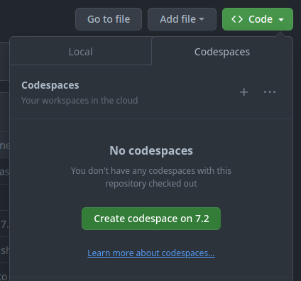
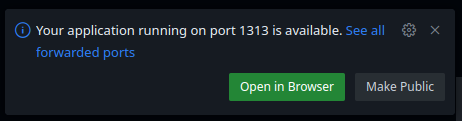